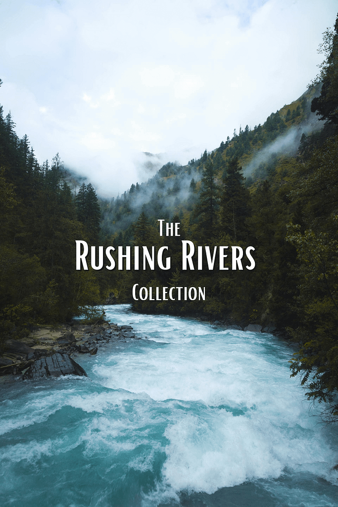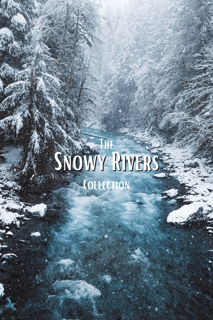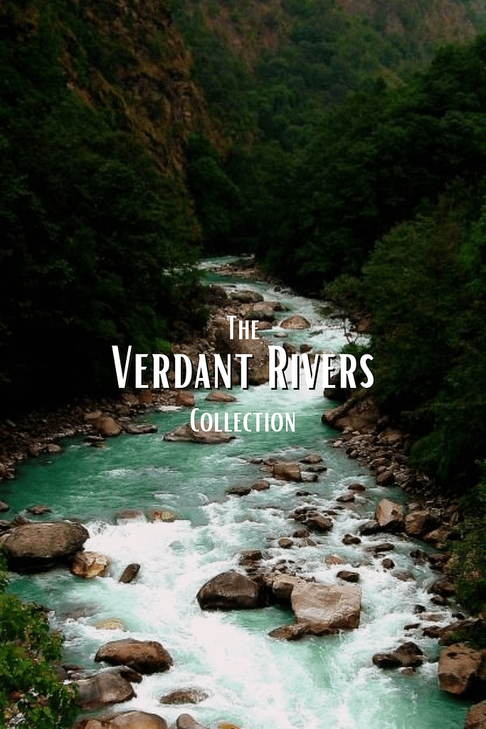
The Rivers Collection
The Rivers Collection color palettes evoke natural tranquility and visual clarity. Inspired by flowing water, these hues span moody blue undertones to vibrant turquoise brilliance. As designers seek fresh, grounded inspiration, these palettes offer a centering point—a cooler spectrum that both calms and captivates. From branding concepts to digital art, the collection reflects the dynamic moods found in river landscapes.
Whether applied in web design, lifestyle branding, or interior styling, these palettes create compelling environments. Deep indigos mirror shaded streambeds, while shimmering aquas channel sunlit currents. Moreover, the subtle gradient transitions between colors allow creators to bridge emotion and motion in their visuals. Bloggers, too, adopt the palette for mood boards and seasonal themes, bringing natural harmony to online spaces.
Across platforms, The Rivers Collection adapts with remarkable versatility. On Canva, its tones enrich story templates with flow and elegance. In Adobe Illustrator, gradients blend seamlessly for packaging and editorial layouts. Even social media graphics benefit—from Instagram grids to Pinterest pins, the palette balances serenity with style. For those shaping digital ecosystems or tactile experiences, The Rivers Collection flows beautifully from concept to execution.
Dive into the visual rhythm of the rivers by clicking on the photos below—each one unlocks a carefully crafted color palette drawn from the water’s own story. Rather than relying on the earthy tones of moss-covered rocks or the golden hues of nearby trees, I chose to center each palette on the river’s pulse itself. The hues are drawn from reflections and ripples that carry the emotional cadence of movement and clarity. It’s not the scenery that defines the color, but the spirit of the current. Let each image lead you deeper into the flow.