
Using Color Theory to Create Color Palettes
Color theory is the study of how colors interact, combine, and affect human perception. It provides a framework for understanding the relationships between colors and their psychological impact. At its core, color theory is based on the color wheel, which organizes colors into primary (red, blue, yellow), secondary (green, orange, purple), and tertiary colors (combinations of primary and secondary colors). This structure helps artists, designers, and creators make informed decisions about color combinations to achieve harmony and contrast.
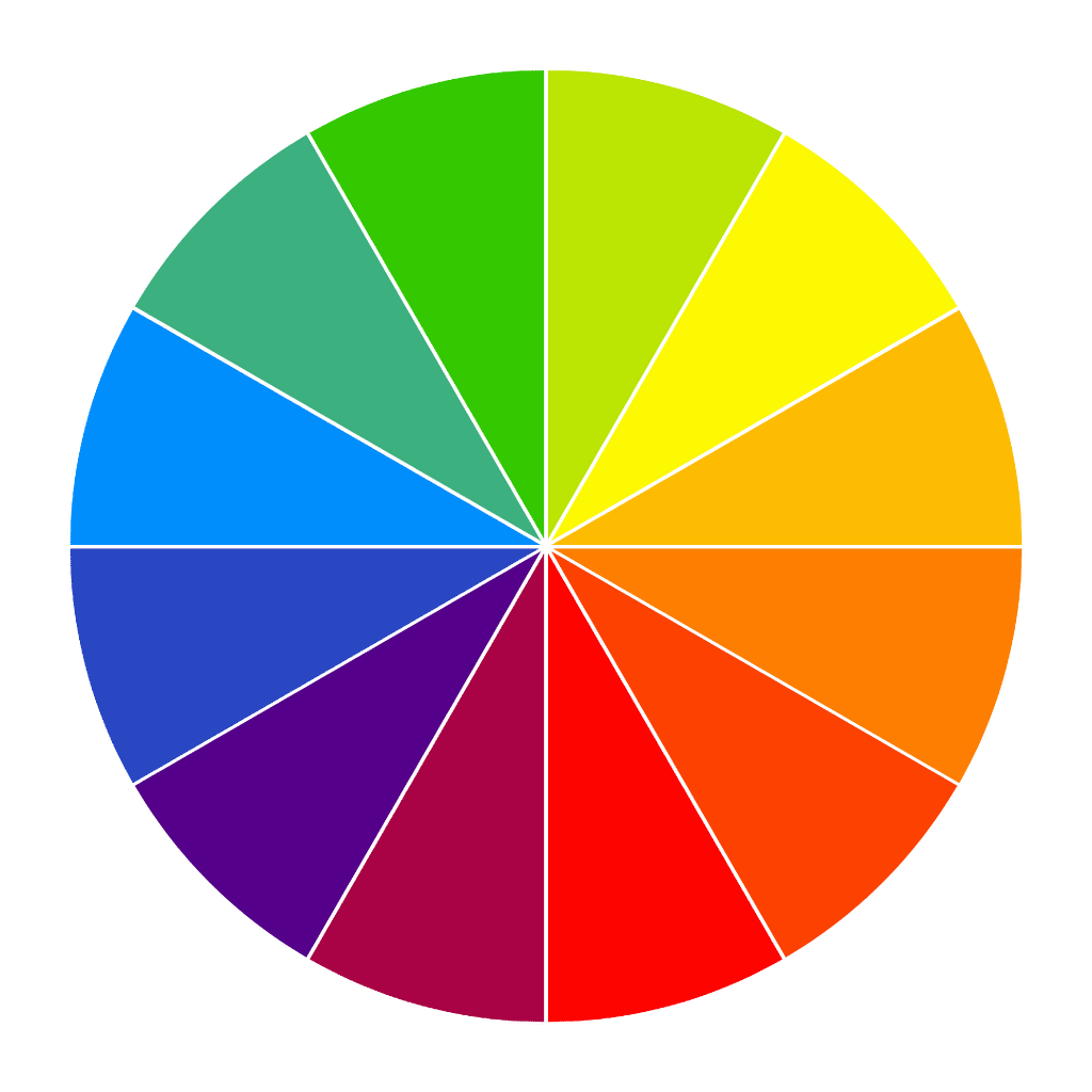
One of the key concepts in color theory is color harmony, which ensures that color combinations are visually appealing. Common harmonies include complementary colors (opposite on the wheel), analogous colors (adjacent), and triadic colors (evenly spaced). Various fields, including graphic design, fashion, and interior decoration, use these principles to create aesthetically pleasing visuals.Understanding harmony helps balance colors to evoke desired emotions and effects.
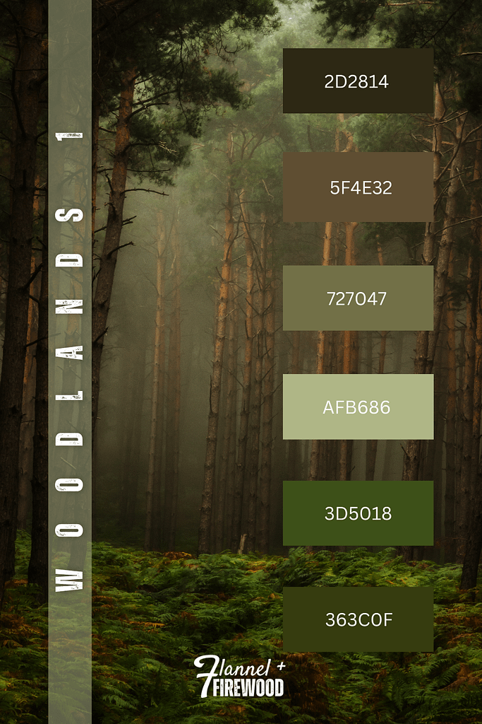
One of the first color palettes created for flannel + firewood is from the first Woodlands Collection. It is the most saved pin on Pinterest because it draws the viewer into a beautiful woodland atmosphere. The colors are soothingly comfortable. The color palette works well together as it is an aesthetically pleasing visual design. The harmony of the various colors of green and brown captures the viewer’s attention, helping them to feel in tune with the photo. Color palettes play a key role in many designs, whether for digital projects or painting a room in your house. A bracelet designer used one of flannel + firewood Woodlands color palettes to design a bracelet tagging our Instagram account.
Color theory also explores the psychological and cultural meanings of colors. For example, red can symbolize passion or danger, while blue often represents calmness and trust. Different cultures may associate colors with varying meanings, influencing branding and marketing decisions. Additionally, concepts such as warm and cool colors, saturation, and value impact how colors are perceived in different contexts. Mastering color theory allows for effective visual communication and enhances artistic and design work.